
Design System
Design System
Building a Scalable Design System for Global Consistency and Local Adaptability
Building a Scalable Design System for Global Consistency and Local Adaptability
Product
Editage
Story
3 min read
Status
Live
Product

Status
Live
Story
3 min read
Goal
Create a scalable, accessible design system for Editage’s global platforms.
Deliverables
70+ reusable components.
Central Figma + dev component library.
Supported 7+ markets with localized flexibility.
Impact
40% increase in component reuse.
30% faster design-to-dev handoffs.
Improved onboarding and cross-team alignment.
TLDR;
TLDR;
Goal
Deliverables
Create a scalable, accessible design system for Editage’s global platforms.
Impact
40% increase in component reuse.
30% faster design-to-dev handoffs.
Improved onboarding and cross-team alignment.
Stage 1
Stage 1
| Setting the Scene
| Setting the Scene
Walking the Path
Walking the Path
Scene 01/02: Context
Scene 01/02: Context
When I joined the Editage 2.0 digital transformation initiative, I found a design ecosystem spread across multiple platforms—mobile apps, web portals, and backend dashboards. Unfortunately, each product had its own inconsistent design language. Developers were rebuilding components from scratch. Designers were solving the same problems in silos.
The result? Fragmented experiences for our users, duplicated efforts for our teams, and slowed product velocity.
Scene 02/02: The Opportunity
Scene 02/02: The Opportunity
We needed a scalable, consistent, and adaptable design foundation—one that would empower product teams across our seven global markets while respecting each region’s unique needs.
We needed a scalable, consistent, and adaptable design foundation—one that would empower product teams across our seven global markets while respecting each region’s unique needs.
Stage 2
| Rising Action
Multiple Benefits
Scene 01/03: Who We Designed For
Our design system had three key user groups:
Designers needed reliable building blocks to move faster and stay consistent.
Developers wanted reusable components with less guesswork.
Product teams require seamless experiences across markets without reinventing the wheel.
“We’re spending more time aligning than designing.” — Purav, Editage Senior Developer
“I just want to trust the components and focus on experience.” — Yumiko, Japan PM
Scene 02/03: Design Problem
Scene 02/03: Design Problem
How might we build a design system that balances global consistency with local flexibility, while remaining accessible and scalable for all users?
How might we build a design system that balances global consistency with local flexibility, while remaining accessible and scalable for all users?
Scene 03/03: The Challenge
Scene 03/03: The Challenge
Design systems aren’t just made of tokens and components—they're built through cross-functional collaboration. The real challenge wasn’t picking colors or font sizes; it was building trust and alignment across teams, regions, and roles, under tight deadlines.
Design systems aren’t just made of tokens and components—they're built through cross-functional collaboration. The real challenge wasn’t picking colors or font sizes; it was building trust and alignment across teams, regions, and roles, under tight deadlines.
Stage 3
| Climax
The Foundation Stone
Scene 01/03: Research & Methodology
To establish the right foundation, I explored multiple design system methodologies:
Material Design offered robust guidance but was too prescriptive.
The 8-Point Grid helped with spacing but lacked a component hierarchy.
Atomic Design stood out—it provided a modular system from atoms to pages, offering clarity and scalability.
Scene 02/03: Making Accessibility a Foundation
Accessibility wasn’t an add-on—it was built in from the start.
I followed WCAG 2.0 guidelines:
High color contrast
Fonts with clear letterforms and legible weights
Meaning conveyed beyond just color
I also selected platform-native typefaces and icon sets for better readability across devices and languages.
Stage 3
| Climax
The Foundation Stone
Scene 03/03: Working Together Across Markets
I partnered closely with developers and PMs in markets like Japan, Korea, China, and the U.S. We didn’t just deliver a system—we co-created it. Their feedback shaped everything from component behavior to localization support.
Scene 01/03: Research & Methodology
To establish the right foundation, I explored multiple design system methodologies:
Material Design offered robust guidance but was too prescriptive.
The 8-Point Grid helped with spacing but lacked a component hierarchy.
Atomic Design stood out—it provided a modular system from atoms to pages, offering clarity and scalability.
Scene 02/03: Making Accessibility a Foundation
Accessibility wasn’t an add-on—it was built in from the start.
I followed WCAG 2.0 guidelines:
High color contrast
Fonts with clear letterforms and legible weights
Meaning conveyed beyond just color
I also selected platform-native typefaces and icon sets for better readability across devices and languages.
Stage 4
| Solving The Problem
Atomic Approach
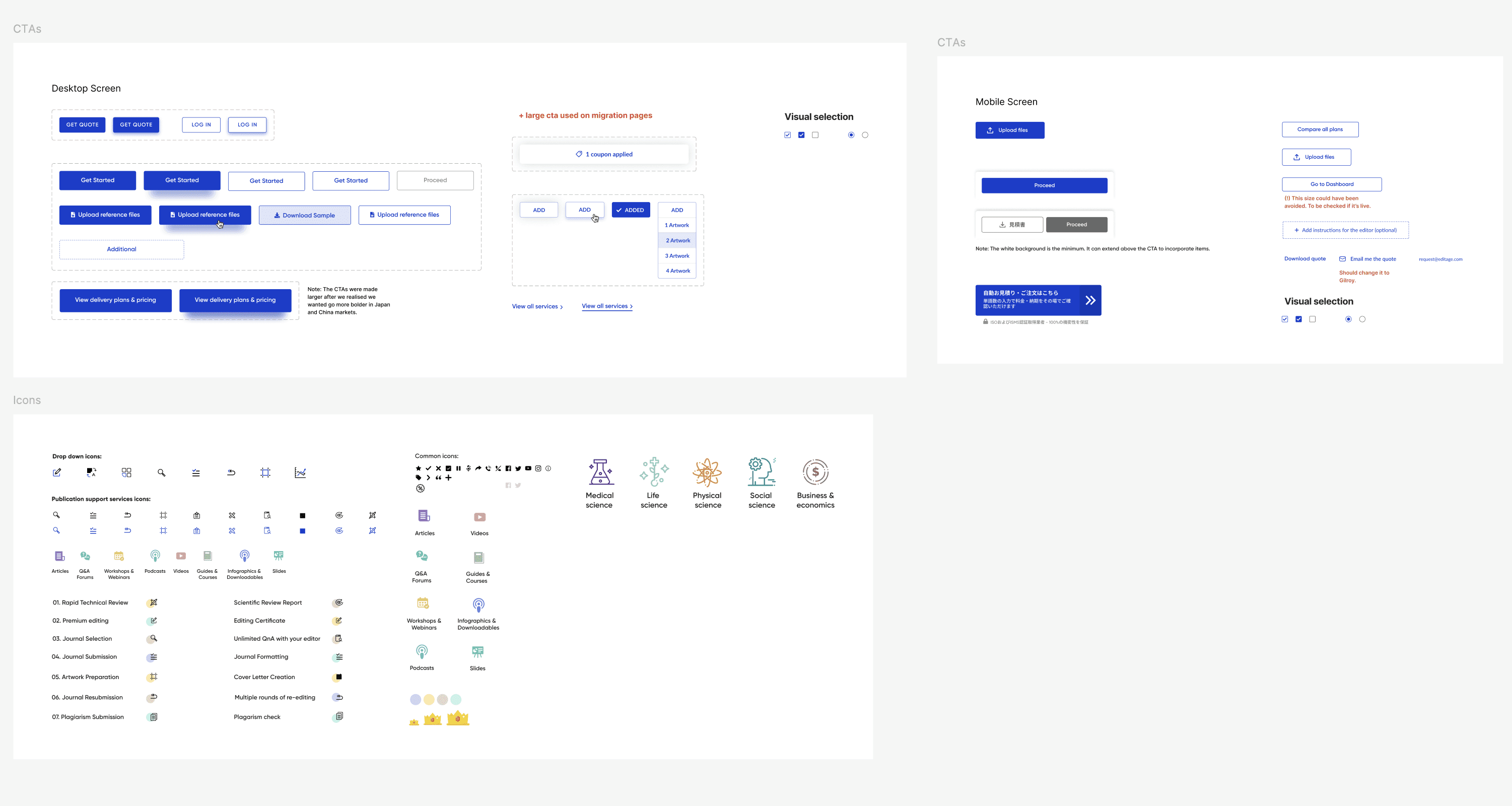
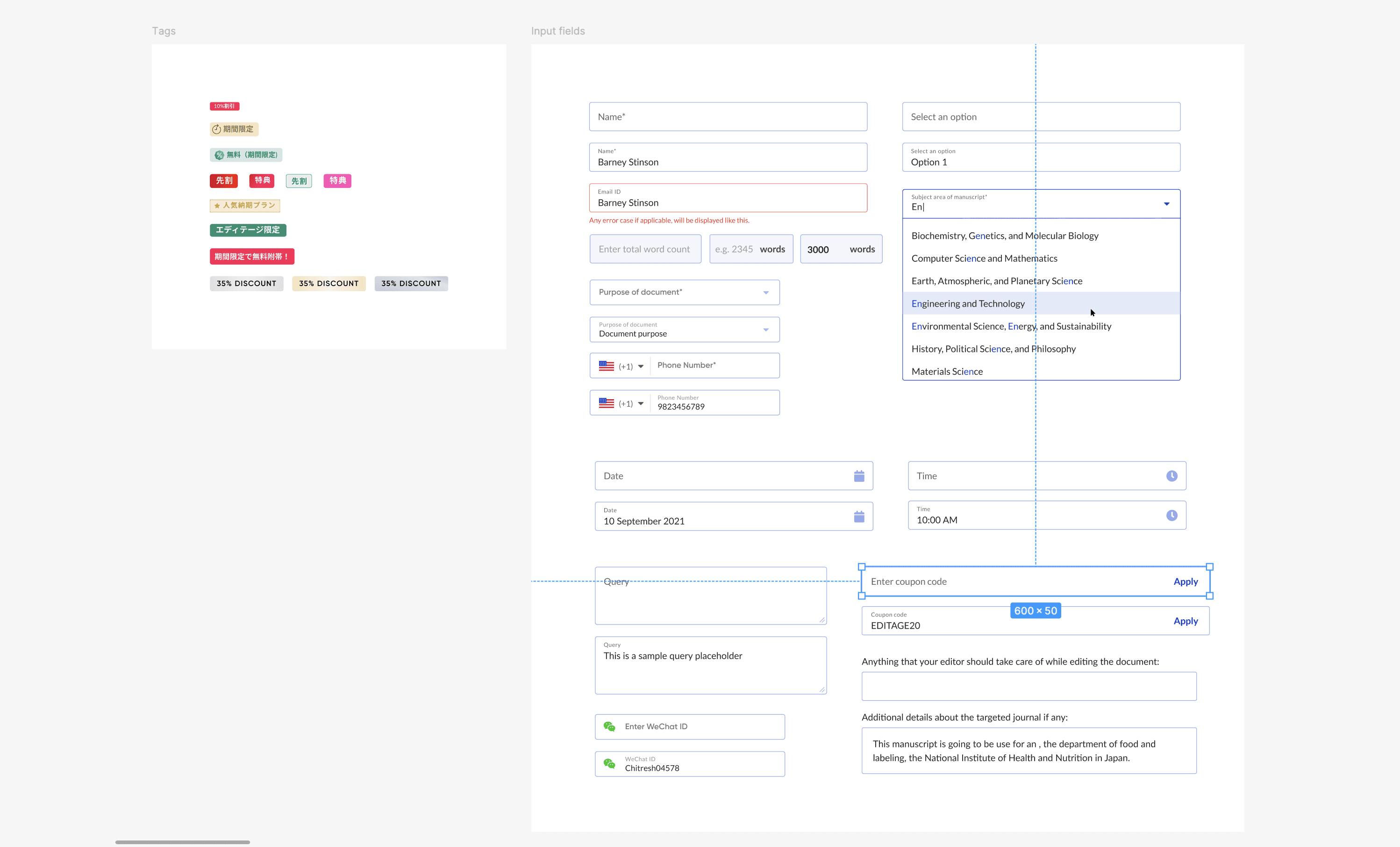
Scene 01/05: What We Delivered
Atomic Design just clicked. For a global product needing both consistency and adaptability, its hierarchical structure—Atoms, Molecules, Organisms—was perfect.
Atoms – Buttons, colors, text styles
Molecules – Input groups, form rows, nav items
Organisms – Headers, cards, search modules
Each layer had clear documentation and naming conventions to guide design and development teams.
Scene 02/05: Atoms
Basic units like buttons, labels, inputs, and color styles formed our atomic layer.
Scene 03/03: Working Together Across Markets
I partnered closely with developers and PMs in markets like Japan, Korea, China, and the U.S. We didn’t just deliver a system—we co-created it. Their feedback shaped everything from component behavior to localization support.
Scene 03/05: Molecules
Combining atoms to create usable UI units—e.g., search bars.
Stage 4
| Solving The Problem
Atomic Approach
Scene 01/05: What We Delivered
Atomic Design just clicked. For a global product needing both consistency and adaptability, its hierarchical structure—Atoms, Molecules, Organisms—was perfect.
Atoms – Buttons, colors, text styles
Molecules – Input groups, form rows, nav items
Organisms – Headers, cards, search modules
Each layer had clear documentation and naming conventions to guide design and development teams.
Scene 04/05: Organisms
Larger patterns like nav bars and card grids created reusable layout systems.
Scene 02/05: Atoms
Basic units like buttons, labels, inputs, and color styles formed our atomic layer.

Scene 03/05: Molecules
Combining atoms to create usable UI units—e.g., search bars.
Scene 05/05: File Distribution
The system was built to support 7+ markets (Japan, China, Korea, ROW), with localized variants. We partnered with PMs to tailor components to each region’s needs.
“Finally, we can reuse components across markets without breaking consistency.” — Ada, China PM
Stage 5
| (Re)solution
Lessons & Outcomes
Scene 01/02: What Did I Learn
Designing with developers = better adoption.
Documentation is just as important as the design itself.
Accessibility is easier when you start early.
Flexibility + structure is possible with the right model.

Scene 04/05: Organisms
Larger patterns like nav bars and card grids created reusable layout systems.
Scene 02/02: What Was Achieved
40% increase in component reuse in 3 months.
30% faster handoffs from design to development.
Reduced design inconsistencies across 5+ platforms.
Smoother onboarding for new team members.
Extras
Final Thoughts
This wasn’t just about building a library. It empowered teams to move faster, stay consistent, and design better experiences together. The system we built is still growing, just like the products it supports.
Extras
Details & Links
Years
2019 2020 2021 2022
Team
7 Designers | 5 Developers | 4 Product Managers
My Responsibilities
🧮 Editage Design System
💻 Editage 2.0 Dashboard
Scene 05/05: File Distribution
The system was built to support 7+ markets (Japan, China, Korea, ROW), with localized variants. We partnered with PMs to tailor components to each region’s needs.
“Finally, we can reuse components across markets without breaking consistency.” — Ada, China PM
Lessons & Outcomes
Stage 5
| (Re)solution
Scene 01/02: What Did I Learn
Designing with developers = better adoption.
Documentation is just as important as the design itself.
Accessibility is easier when you start early.
Flexibility + structure is possible with the right model.
Scene 02/02: What Was Achieved
40% increase in component reuse in 3 months.
30% faster handoffs from design to development.
Reduced design inconsistencies across 5+ platforms.
Smoother onboarding for new team members.
Extras
Final Thoughts
This wasn’t just about building a library. It empowered teams to move faster, stay consistent, and design better experiences together. The system we built is still growing, just like the products it supports.
Extras
Details & Links
Year
2019 2020 2021 2022
Team
7 Designers | 5 Developers | 4 Product Managers
My Responsibilities
🧮 Manage Order flow
💻 Feedback flow